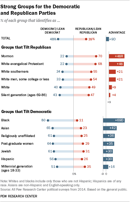
I came across an old blog post where the author (Jeff Shaffer) attempted to recreate the Pew Research graph (included below) using Tableau. He succeeded—to my eye at least—and made something that looks really attractive and really close to the original Pew graph. See the original blog post for a comparison between the original and his reconstruction
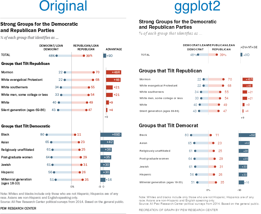
Reading the post got me wondering if I could recreate the Pew graph myself using R and ggplot2. There is a ton of “non-standard” stuff going on in the original Pew graph (for starters, it’s not really one graph. It’s six) and I was curious how close I could get.
Turns out I was able to get pretty close, I think. Here’s my final version side-by-side with the original. There are a couple of detailed that I couldn’t solve (like the graphs are just a little too compressed). And the process of creating this was…fiddly, to say the least. I ended up with numerous ‘magic’ constants that I had to revise over and over until I got something that looked reasonable1 . And one bit—adding spaces to a label to push its alignment left—I’m downright ashamed of (but I couldn’t find another way to accomplish my goal). Still, I’m pretty happy with the final product.
Note, like the original post’s author, I’m not sure I’d argue this is the best way to display this data. The odd axis treatment on the right hand bar charts seems likely to confuse. But, still, this is an attractive visualizations and I’ve always appreciated Pew’s “house” style.
If you’re interested in the code, I’ve posted it to GitHub.
There are a lot more hardcoded constants throughout my code, but seven parameters gave me enough trouble that I created named constants for them. ↩︎
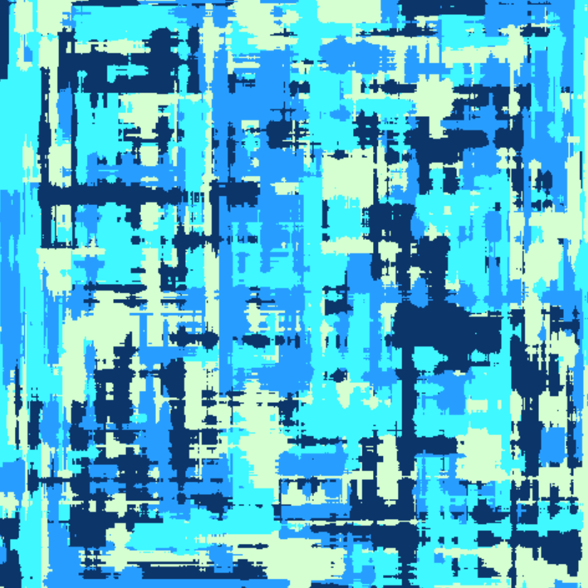
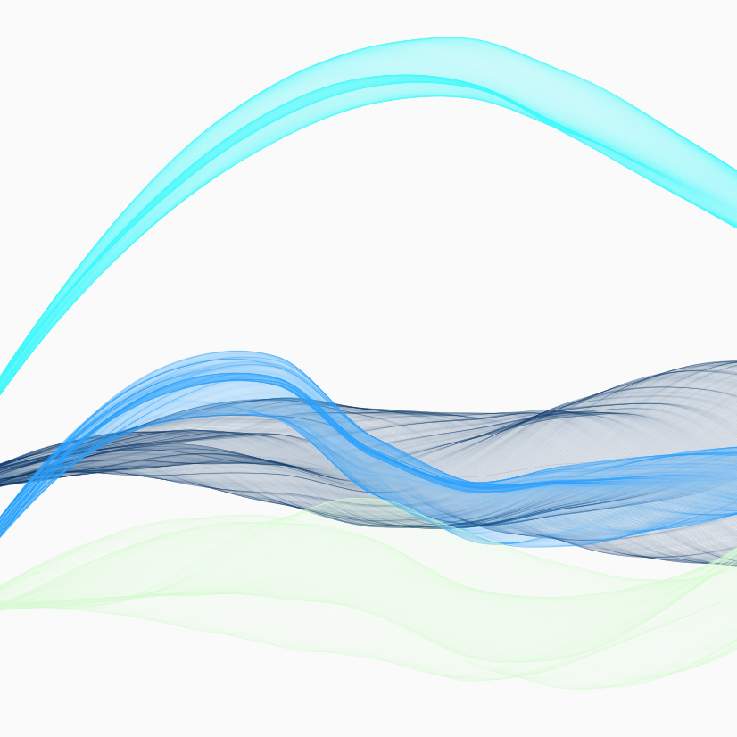
I’ve been playing around with the ARtsy package. I’ve just been using the packages predefined functions with (mostly) function defaults. I finished going through a first pass at all the functions today. Here are my favorites among the many trial pieces I created.
I’ve been following the R-bloggers site for years. It’s a feed aggregator for blog posts about R. I’ve published a few recent posts on R (and have a couple more queued up). So I figured it was time to submit this site. In preparation, I’ve got a new category (“R”) that you can subscribe to directly.
If you’re an R programmer and you’ve never checked out R-blogger, it’s a great way to find interesting articles.
I’ve been working the last few days on polishing my frequency table generator. Formerly called FreqR, I simplified it to simplefreqs.
The repository can be found on GitHub, and I’ve got a simple documentation website running GitHub Pages.
It’s just about ready to be submitted to CRAN. But before submitting it, I’d love to have some testers take it for a spin. If you’re an R user and you ever need to produce simple frequency tables, give it a whirl.
Many years ago I created a R package to construct simple frequency tables. For all of R’s power, I’ve always found this most basic of summary functions to be lacking. So I created one that I liked for myself. I got a minimally viable package working and started using it for myself, but I never put in the effort to get it listed on CRAN.
Fast forward five years and I still find myself using my package all the time, but always with a need for caution as it’s not a package others on my team use or can “easily” install1. I think it might be time to change that.
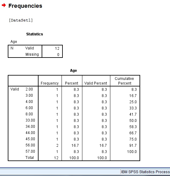
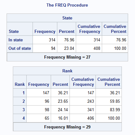
When starting virtually any analysis my first step is always to get the “lay of the land” and that almost always means examining the frequencies of my variables. Years ago I was mainly a SAS users—andway before that an SPSS user—and both offer simple, attractive, full-features functions to create frequency tables. Not so with R. The tools are there, of course, but it takes a fair bit of work. It’s kinda the difference between being given a house or being given a pile of wood, a hammer, and some nails.
And when I want a frequency table, I don’t want to do a lot of work to get it. I’m looking for something that’s easy, has sensible defaults—but the ability to customize when needed—and provides easy to read (and hopefully attractive) output both at the console and in knitted documents. I didn’t feel like any package really offered this previously. Hence why I made my package in the first place.
So maybe it’s time to get my package cleaned up and onto CRAN. But, before I go to the trouble, it seems prudent to see what the current state of frequency table functions is in the wider ecosystem. Am I trying to solve a problem that other packages have already solved (and perhaps better)? It feels like information I definitely should know before devoting a lot of time to this project.
So I undertook to identify packages with similar functions and to evaluate them on the features they have (and don’t have). What I found is that there are tons of ways to produce frequency tables. Here are eleven with my views on each.
base::table
The most obvious starting point for producing a frequency table is to simply use the base::table function. This is a minimal frills approach that, “out-of-the-box”, doesn’t offer a ton. You feed it a variable, it provides a simple (horizontal) table of frequencies.
That’s it.
No proportions, no cumulative results. By default, NAs are excluded. Of course, there is plenty you can do from there to get proportions, etc., if that’s what you want. But you’ll have to do some work to get this table to show you anything other than simple counts.
Likewise for the next obvious candidate, dplyr::count. I’m pretty fully immeshed in the ’Tidyverse’ and use its approach every time I touch R. So dplyr::count is a natural option for a lot of my work. But the reality is that, just like base::table, it takes a lot of work to get basic information I want from a frequency table out of dplyr:: count. By default you just get (are you ready for this): counts. If you need proportions are cumulative proportions, then you’ll be mutating the data yourself from there. Super powerful, super easy to program, super not what I’m looking for.
Next I turned my attention to a few packages that I’d used previously for frequency tables to remind myself what they had to offer. First up was descr::freq. To the best of my recollection, this may have been the package I used most often for frequency tables prior to producing my own attempt. There’s a lot here I like, and I’m sure I drew inspiration from it. It gives counts, but also percents. It, by default, shows missing values and gives valid percents as well. It also, by default, produces an accompanying bar graph of the counts. This is very much along the lines of what I’m looking
>descr::freq(iris$Species)iris$SpeciesFrequencyPercentValidPercentsetosa4731.33332.19versicolor4932.66733.56virginica5033.33334.25NA's 4 2.667 Total 150 100.000 100.00
Attribute
Rating
Input accepted
Vector
Number of Dependencies
5
Pretty Console Output
No
Pretty Knitted Output
No
Prints Total row
Yes
Prints Metadata
No
Sorts Results by Frequency
No
Allows Optional Weighting
Yes
Produces Accompanying Graph
Yes
Number of Decimals Printed
3/2
janitor::tabyl
Another option I’ve used in the past comes from the janitor:: package: janitor::tabyl. It would be doing a disservice to this function to just label it a frequency table function. It’s far more than that. It’s meant as a replacement to base::table and comes with a myriad of ways to format the output to your liking. Unfortunately, simply out-of-the-box, the output isn’t what I’m looking for. You get frequencies, percents, and valid percents, but not formatted in a particularly appearing way. Not right for what I’m looking for.
A third option I’ve used in the past is questionr::freq. While this package is designed to simplify survey analysis, it has a very good frequency function. By default it gives a lot of information in a fairly condensed format: n, percent, valid percent, percent cumulative, and valid percent cumulative. It’s perfectly serviceable, though, to my eyes at least, the output is so compressed that it’s actually a little hard to read.
During my environment scan I came across two packages that certainly had promising names. The first was called freqtables:: and has a function called freqtables::freq_table. This function also gives a lot of good information by default, but unfortunately gives a lot of information that I’m not looking for as well (like a standard error for each category and upper and lower confidence intervals).
The second promisingly named function was frequency:: and its function frequency::freq. This package seeks to produce SPSS/SAS-like frequency tables. And it does. The output is attractive, and information-rich. But, unfortunately, by default it is directed to an html output. It is possible to get console output through setting some an option, but that’s, unfortunately, not what I’m looking for.
There were other options I came across during my environment scan that had less obvious package names but seemed worth examining. One of these was cleaner::freq. cleaner::freq produces some very attractive output with percents, cumulative counts and cumulative counts. It doesn’t show missing by default but it does offer this as an option, along with a lot of other options as well. One thing that I especially like about this option is that it formats the output differently in the console and in a rmarkdown/quarto document. By setting output=“axis” the code will render as a pretty nice table.
summarytools::freq was another package I wasn’t familiar with but that had a promising function. Summary tools also produces some very attractive and informative output. It by default shows NAs and has lots of different options. There’s a Markdown option too, but, unlike with cleaner::freq you have to set it yourself.
>summarytools::freq(iris,Species)Frequenciesiris$SpeciesType:FactorFreq % Valid % ValidCum. % Total % TotalCum.--------------------------------------------------------------------setosa4732.1932.1931.3331.33versicolor4933.5665.7532.6764.00virginica5034.25100.0033.3397.33<NA>42.67100.00Total150100.00100.00100.00100.00
Attribute
Rating
Input accepted
Vector or Tidy Var
Number of Dependencies
17
Pretty Console Output
Yes
Pretty Knitted Output
Yes
Prints Total row
Yes
Prints Metadata
Yes
Sorts Results by Frequency
Yes
Allows Optional Weighting
Yes
Produces Accompanying Graph
No
Number of Decimals Printed
N/A
Epidisplay::tab1
I’m not sure how I came across epidisplay::tab1 but it produces a competent frequency table. By default it shows a bar chart. The console output is a bit minimal (showing only counts, percents, and valid percents) and there is no rmarkdown option. But, it has a lot of options for customization.
>epiDisplay::tab1(iris$Species,sort.group=T)iris$Species:Frequency %(NA+) %(NA-)setosa4731.332.2versicolor4932.733.6virginica5033.334.2NA's 4 2.7 0.0 Total 150 100.0 100.0
Attribute
Rating
Input accepted
Vector
Number of Dependencies
4
Pretty Console Output
No
Pretty Knitted Output
No
Prints Total row
Yes
Prints Metadata
No
Sorts Results by Frequency
Yes
Allows Optional Weighting
No
Produces Accompanying Graph
Yes
Number of Decimals Printed
1
Datawizard::data_tabulate
The last package I came across was datawizard::data_tabulate. This function produces decent looking console output that renders as valid markdown as well. By defaults NAs are printed and it includes percents, valid percents, and cumulative percents. Options for customizing on this one are minimal though.
>datawizard::data_tabulate(iris$Species)iris$Species<categorical># total N=150 valid N=146Value|N|Raw % |Valid % |Cumulative %-----------+----+-------+---------+-------------setosa|47|31.33|32.19|32.19versicolor|49|32.67|33.56|65.75virginica|50|33.33|34.25|100.00<NA>|4|2.67|<NA>|<NA>
Attribute
Rating
Input accepted
Vector
Number of Dependencies
3
Pretty Console Output
Yes
Pretty Knitted Output
Yes
Prints Total row
No
Prints Metadata
Yes
Sorts Results by Frequency
No
Allows Optional Weighting
No
Produces Accompanying Graph
No
Number of Decimals Printed
2
FreqR:freq
Finally, seems only fair that I put my (non-CRAN) package up to the same scrutiny that I put the others up to. I must say, I like my console output. I appreciate the seperation top and bottom dividers and the divider of the header from the table. FreqR:freq gives the counts, percents, cumulative frequency, and cumulative percent. By default I include NAs, but I don’t give valid percents, which may be a mistake. It also doesn’t render particularly well (or at all) in markdown.
Here then is my summary. If I had to go with one of these today–other than my own–it’d probably be either cleaner::freq or summarytools::freq. Both produce attractive output both in markdown and on the console. And, through this exercise, it’s become clear to me that is my number one requirement. But neither fits the bill in other ways. Neither produces a graph by default, and I really appreciate that. cleaner:: doesn’t show missing by default, while summarytools:: is ‘heavy’ with 17 dependencies.
For me, this means I do, in fact, want to proceed with revising FreqR and submitting it to CRAN (almost certainly with a new name…I’m thinking “SimpleFreqs”). This exercise has definitely showed me some things I, personally, view as critical for a frequency table. I need the output to be pretty. I want it to produce an accompany graph. Missing should be shown by default, as should a totals row. Some of this my package currently does, some I’ll need to add. I’m excited to get started.
Actually, installing from GitHub is super easy, but it’s a tiny barrier and adds just enough extra friction that the added friction during coding review isn’t worth it for my little package. ↩︎


