One dumb thought at a time

Category: R

Experimenting with Copilot in RStudio

I’ve been fascinated by the potential of Github Copilot for quite some time now. I was so interested in playing with Copilot that, earlier this spring, I spent a fair bit of time learning to use Visual Studio Code and getting it set up for R development. And, while VS Code proved to not be especially to my liking (at least for R development and compared to RStudio), I was quickly enamored by my early experience with Copilot.

So when I saw this post pointing out that the development version of RStudio contained Copilot integration, I was very excited. I ignored all the big flashing “beware” signs that come along with a daily development build and downloaded it immediately.

While I’ve only been working with it a couple of days, I’m kinda in love. Here are some initial thoughts.

Setup

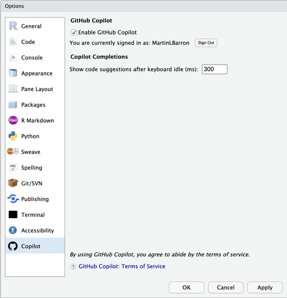
Setup is super easy. Simply open your global options (tool -> Global Options… -> Copilot) and enable it. You’ll need to sign into Copilot from RStudio, but that’s also just a simple process involving clicking a url, and entering the usage code presented1. One bug I stumbled across, in my limited experience, is that Rstudio’s not great at remembering that you’ve enabled Copilot. So you may find yourself having to turn it on again if you close and relaunch. But, daily build, beware, etc.

Usage

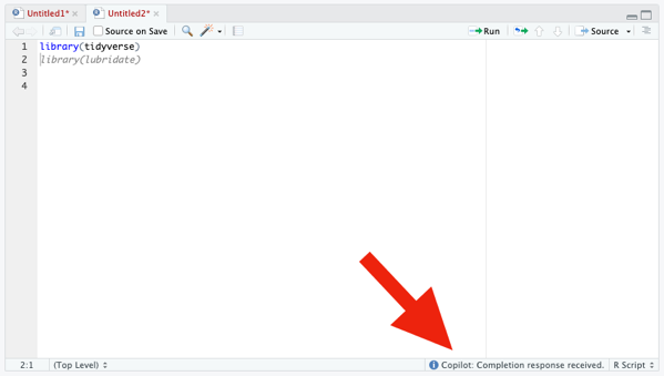
Once enabled, use of Copilot is very straightforward. Open an editor window; start typing. Copilot captures your code and suggest (through gray, italicized text). Like the selection? press tab to accept it. Don’t like it, simply continue typing (or press Esc) and the suggestion disappears.

If Copilot isn’t actively suggesting anything to you at the moment, the only visual indication that it’s running is some text in the lower right corner of the editor window. Otherwise, there are no visual differences to the interface.

From my experience with Copilot in VS Code, I know that it’s possible to have Copilot cycle through suggestions, if you don’t like the first. That appears to not be working yet in RStudio (or, at least, I couldn’t figure out how to trigger it). In VS Code (and other? IDEs) you can cycle using Option/Alt + ]. That does nothing, currently, in RStudio.

Code Suggestion

Of course, the whole point of Copilot is code completion and, more particularly, project-relevent code completion. So to do a minimal test, I need a project.  So here’s the little toy task I set myself to try out Copilot: create a plot of drug crimes over time (relative to other crime types) for the city of Chicago. This is a really straight forward task with a few simple components:

  1. Download the public crimes data from the City of Chicago’s website.
  2. Explore the data to understand the variables and values of interest
  3. Perform any necessary cleaning
  4. Create my plot

As noted above, my first step is to just acquire the data from the City of Chicago’s public portal. Based on my previous experience with Copilot in VS Code, I knew Copilot offered reasonable suggestions based on comments, so I added:

# Read crime data from city of chicago website

And it suggested:

crime <- read_csv("https://data.cityofchicago.org/api/views/ijzp-q8t2/rows.csv?accessType=DOWNLOAD")

 Which…is exactly—and frighteningly—correct. I wasn’t about to trust it blindly, but 10 seconds of Googling confirmed that ijzp-q8t2 is, indeed, the cumulative crimes data I was looking for. And just like that, I kinda fell in love with Copilot all over again.

EDA

…And then Copilot seemed to break. I typed (and typed) and it suggeted nothing.  All I wanted to do for my exploratory data analysis was to look at the list of variables, find the crime type variable and explore its values, and find the date variable and figure out its format.  So I typed the following and Copilot suggested nothing at all.

# Explore crime data
str(crime)

library(simplefreqs)
freq(crime$`Primary Type`)
length(levels(factor(crime$`Primary Type`)))

Again, daily build, beware, etc. etc.  I restarted, confirmed Copilot was enabled, and went back to work.

Data Cleaning

…And so did Copilot.  I typed :

# recode `Primary Type`
Df <- crime |>     
    rename (

And it auto-suggested exactly what I was planning to do.  It even recognized that I was using the native pipe character and anticipated—correctly—that I’d want to continue my pipeline:

# recode `Primary Type`
Df <- crime |>
    rename (primary_type = `Primary Type`) |>

So that’s what I did, I continued my pipeline by adding mutate ( and it autofilled the rest for me.

# recode `Primary Type`
df <- crime |> 
     rename (primary_type = `Primary Type`) |>
     mutate(primary_type = fct_lump(primary_type, 10))

Here I was faced with a little bit of a question.  I didn’t actually intend to lump my factor levels here.  My original intention was to simply transform the variable into a factor with all levels intact.  But, lumping here wasn’t a bad idea.  It just wasn’t my original intention.  So, do I stick with my original intention or follow Copilot?  I choose to follow Copilot, with a twist (rather than selecting the 10 largest levels, I lumped all levels where the proportion of cases was below .5%).

I then noticed that the raw data actually already did some grouping and had an “OTHER OFFENSE” category.  So I needed to combine it with my new “Other” category.  I didn’t remember the forcats command to do this…and neither did Copilot.  It suggested I fct_gather() ….which isn’t a valid forcats function! What I was looking for was fct_collapse() or fct_other(). I ended up doing it myself as it seemed to really confuse Copilot.

df <- crime |> 
    rename (primary_type = `Primary Type`) |>
    mutate(primary_type = fct_lump_prop(primary_type, .005)) |>
    mutate(primary_type = fct_other(primary_type, drop=c('Other', "OTHER OFFENSE"), other_level="OTHER”))

Next up: date.  Dates in this file are stored as character strings with format “MM/DD/YYYY HH:MM:SS AM/PM”.  I wanted to transform this to a simple Date variable.  I got to here:

# Recode Date to date variable
df <- df |> 

and it filled in the rest:

df <- df |>    
    mutate(date = as.Date(Date, format = "%m/%d/%Y”))

I can never remember my date formats so—trust but verify—a little googling was needed.  It showed that the Copilot suggestion was exactly what I was looking for.

Initial Plotting

I started the next section with a comment.  I got to # Plot and Copilot filled in the result # Plot crime by date.  Maybe that would have been better “crime type”, but it seemed good enough so I accepted it.  Copilot then immediately added a ggplot block at me

# Plot crime by date
df |> 
  ggplot(aes(x=date)) + 
  geom_freqpoly(aes(color=primary_type), binwidth=30) +
  scale_x_date(date_breaks = "1 month", date_labels = "%b %Y") + 
  theme(axis.text.x = element_text(angle = 90, hjust = 1))

Now, I’ve never used geom_freqpoly—I had to google to see if it was real and what it did.  It’s not what I was looking for but it’s not unreasonable, either. Here’s the plot it produced.  

Not attractive, but in the ballpark. By binning to 30 days, we get rough monthly indicators and it appropriately scaled the axis to 1 month (though it mean the there were so many labels they were unreadable). It also is hard to tell what line is the narcotics line, which was my original goal—not that I’ve done anything to indicate that to Copilot.  

Data Wrangling

I decided then to do some wrangling and get the data in shape to be plotted using geom_line.  Specifically I wanted to truly summarize by month (not rely on a 30 day shorthand). So I needed to group the data by year, month, and primary type, summarize the counts, and then construct a new date variable indicating the aggregate month and year.

Copilot was moderately helpful here.  To be honest, I knew what I needed to do and I just started typing.  I kinda didn’t give Copilot much of a chance to chime in.  Here’s what this chunk of code looked like.

# Prepare data for plotting
df <- df |>
  mutate(month=month(date), year=year(date)) |>
   group_by(year, month, primary_type) |>
  summarise(crime_count=n()) |>
  mutate(date=as.Date(paste(year, month, "01", sep="-"))) |>
  ungroup()

Final Plotting

Finally, with my data ready, I could create the plot I wanted.  I was curious what it would do with a less well known package so I imported `gghighlight` and went to work.  Here’s what Copilot suggested:

df |>    
ggplot(aes(x=date, y=crime_count)) +    
   geom_line(aes(color=primary_type)) +    
   scale_x_date(date_breaks = "1 month", date_labels = "%b %Y") +
   theme(axis.text.x = element_text(angle = 90, hjust = 1)) +
   gghighlight(max(crime_count) > 1000)

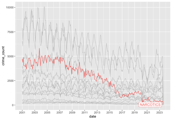
 It guessed—correctly—that I wanted to use geom_line and that I wanted to use gghighlight. It didn’t get my intentions exactly right on gghighlight, but why would it.  Here’s my final edits and the resulting graph.  Drug crimes have basically bottomed out after a (slower) two decade decline.

df |>
ggplot(aes(x=date, y=crime_count)) + 
    geom_line(aes(color=primary_type)) +
    scale_x_date(date_breaks = "2 year", date_labels = "%Y") +
    gghighlight(primary_type ==NARCOTICS")

Conclusion

Copilot isn’t perfect. But, wow. I’m impressed by it.  More often than not, it knows exactly (or really closely) my intent and is able to give me some really useful starter code. I could easily see this becoming as indispensable to my coding as color coded syntax?

A few months back I gave an internal talk where I made some predictions for the future of analysis/data science. One of those was predictions was that my entire team would all be using something like Github Copilot before the end of the year. Having seen Copilot in action in RStudio, I’m more sure of this prediction than ever.

Postscript

There’s no real reason to look at it, but I posted the entire file of code generated above to Github. I needed to add a simple readme, so I created a blank text file, added “# Copilot RStudio Experiment” and it autofilled the following.

This is a simple experiment to test the capabilities of GitHub Copilot. The goal is to create a simple R script that will read in a CSV file, perform some basic data cleaning, and then create a plot.
  1. This assumes you’re already signed up for Copilot and logged into Github. ↩︎
Reconstructing A Complex Graph Using GGPlot2

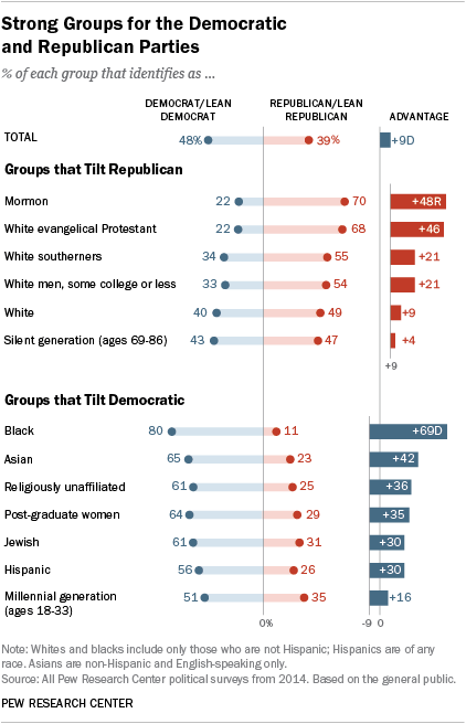
I came across an old blog post where the author (Jeff Shaffer) attempted to recreate the Pew Research graph (included below) using Tableau. He succeeded—to my eye at least—and made something that looks really attractive and really close to the original Pew graph. See the original blog post for a comparison between the original and his reconstruction

Reading the post got me wondering if I could recreate the Pew graph myself using R and ggplot2. There is a ton of “non-standard” stuff going on in the original Pew graph (for starters, it’s not really one graph. It’s six) and I was curious how close I could get.

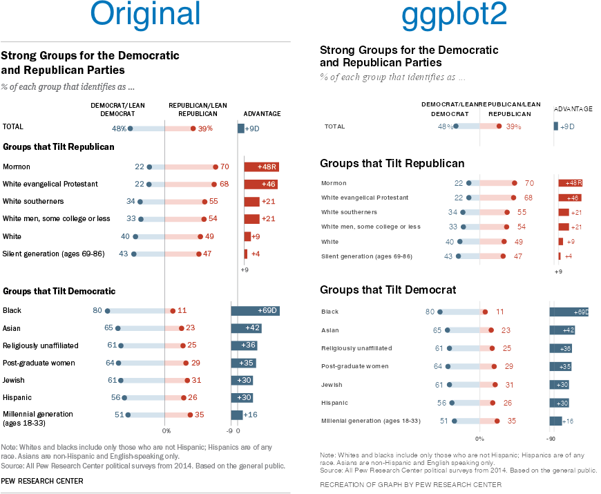
Turns out I was able to get pretty close, I think. Here’s my final version side-by-side with the original. There are a couple of detailed that I couldn’t solve (like the graphs are just a little too compressed). And the process of creating this was…fiddly, to say the least. I ended up with numerous ‘magic’ constants that I had to revise over and over until I got something that looked reasonable1 . And one bit—adding spaces to a label to push its alignment left—I’m downright ashamed of (but I couldn’t find another way to accomplish my goal). Still, I’m pretty happy with the final product.

Comparison of Pew Research graph and ggplot2 recreation.

Note, like the original post’s author, I’m not sure I’d argue this is the best way to display this data. The odd axis treatment on the right hand bar charts seems likely to confuse. But, still, this is an attractive visualizations and I’ve always appreciated Pew’s “house” style.

If you’re interested in the code, I’ve posted it to GitHub.

  1. There are a lot more hardcoded constants throughout my code, but seven parameters gave me enough trouble that I created named constants for them. ↩︎

Introducing simplefreqs

I’ve been working the last few days on polishing my frequency table generator. Formerly called FreqR, I simplified it to simplefreqs.

The repository can be found on GitHub, and I’ve got a simple documentation website running GitHub Pages.

It’s just about ready to be submitted to CRAN. But before submitting it, I’d love to have some testers take it for a spin. If you’re an R user and you ever need to produce simple frequency tables, give it a whirl.

An environment scan of frequency table functions

Many years ago I created a R package to construct simple frequency tables.  For all of R’s power, I’ve always found this most basic of summary functions to be lacking.  So I created one that I liked for myself. I got a minimally viable package working and started using it for myself, but I never put in the effort to get it listed on CRAN. 

Fast forward five years and I still find myself using my package all the time, but always with a need for caution as it’s not a package others on my team use or can “easily” install1. I think it might be time to change that.

When starting virtually any analysis my first step is always to get the “lay of the land” and that almost always means examining the frequencies of my variables.  Years ago I was mainly a SAS users—andway before that an SPSS user—and both offer simple, attractive, full-features functions to create frequency tables. Not so with R.  The tools are there, of course, but it takes a fair bit of work. It’s kinda the difference between being given a house or being given a pile of wood, a hammer, and some nails.

And when I want a frequency table, I don’t want to do a lot of work to get it. I’m looking for something that’s easy, has sensible defaults—but the ability to customize when needed—and provides easy to read (and hopefully attractive) output both at the console and in knitted documents.  I didn’t feel like any package really offered this previously.  Hence why I made my package in the first place. 

So maybe it’s time to get my package cleaned up and onto CRAN. But, before I go to the trouble, it seems prudent to see what the current state of frequency table functions is in the wider ecosystem.  Am I trying to solve a problem that other packages have already solved (and perhaps better)?  It feels like information I definitely should know before devoting a lot of time to this project.

So I undertook to identify packages with similar functions and to evaluate them on the features they have (and don’t have).  What I found is that there are tons of ways to produce frequency tables.  Here are eleven with my views on each.

base::table

The most obvious starting point for producing a frequency table is to simply use the base::table function.  This is a minimal frills approach that, “out-of-the-box”, doesn’t offer a ton.  You feed it a variable, it provides a simple (horizontal) table of frequencies. 

That’s it.

No proportions, no cumulative results.  By default, NAs are excluded.  Of course, there is plenty you can do from there to get proportions, etc., if that’s what you want.  But you’ll have to do some work to get this table to show you anything other than simple counts.

> base::table(iris$Species, useNA="always")
setosa versicolor  virginica       <NA> 
    47         49         50          4 
AttributeRating
Input acceptedVector
Number of Dependencies0
Pretty Console OutputNo
Pretty Knitted OutputNo
Prints Total rowNo
Prints MetadataNo
Sorts Results by FrequencyNo
Allows Optional WeightingNo
Produces Accompanying GraphNo
Number of Decimals PrintedN/A

dplyr::count

Likewise for the next obvious candidate, dplyr::count.  I’m pretty fully immeshed in the ’Tidyverse’ and use its approach every time I touch R.  So dplyr::count is a natural option for a lot of my work.  But the reality is that, just like base::table, it takes a lot of work to get basic  information I want from a frequency table out of dplyr:: count.  By default you just get (are you ready for this): counts. If you need proportions are cumulative proportions, then you’ll be mutating the data yourself from there.  Super powerful, super easy to program, super not what I’m looking for.

> iris %>%
+   count(Species)
     Species  n
1     setosa 47
2 versicolor 49
3  virginica 50
4       <NA>  4
AttributeRating
Input acceptedTidy Var
Number of Dependencies13
Pretty Console OutputNo
Pretty Knitted OutputNo
Prints Total rowNo
Prints MetadataNo
Sorts Results by FrequencyYes
Allows Optional WeightingYes
Produces Accompanying GraphNo
Number of Decimals PrintedN/A

descr::freq

Next I turned my attention to a few packages that I’d used previously for frequency tables to remind myself what they had to offer.  First up was descr::freq.  To the best of my recollection, this may have been the package I used most often for frequency tables prior to producing my own attempt.  There’s a lot here I like, and I’m sure I drew inspiration from it.  It gives counts, but also percents.  It, by default, shows missing values and gives valid percents as well.  It also, by default, produces an accompanying bar graph of the counts.  This is very much along the lines of what I’m looking

> descr::freq(iris$Species)
iris$Species 
           Frequency Percent Valid Percent
setosa            47  31.333         32.19
versicolor        49  32.667         33.56
virginica         50  33.333         34.25
NA's               4   2.667              
Total            150 100.000        100.00
AttributeRating
Input acceptedVector
Number of Dependencies5
Pretty Console OutputNo
Pretty Knitted OutputNo
Prints Total rowYes
Prints MetadataNo
Sorts Results by FrequencyNo
Allows Optional WeightingYes
Produces Accompanying GraphYes
Number of Decimals Printed3/2

janitor::tabyl

Another option I’ve used in the past comes from the janitor:: package: janitor::tabyl.  It would be doing a disservice to this function to just label it a frequency table function.  It’s far more than that. It’s meant as a replacement to base::table and comes with a myriad of ways to format the output to your liking.  Unfortunately, simply out-of-the-box, the output isn’t what I’m looking for.  You get frequencies, percents, and valid percents, but not formatted in a particularly appearing way.  Not right for what I’m looking for.

> janitor::tabyl(iris, Species)
    Species  n    percent valid_percent
     setosa 47 0.31333333     0.3219178
 versicolor 49 0.32666667     0.3356164
  virginica 50 0.33333333     0.3424658
       <NA>  4 0.02666667            NA
AttributeRating
Input acceptedData Frame or Vector
Number of Dependencies12
Pretty Console OutputNo
Pretty Knitted OutputNo
Prints Total rowNo
Prints MetadataNo
Sorts Results by FrequencyNo
Allows Optional WeightingNo
Produces Accompanying GraphNo
Number of Decimals Printed7

questionr::freq

A third option I’ve used in the past is questionr::freq.  While this package is designed to simplify survey analysis, it has a very good frequency function.  By default it gives a lot of information in a fairly condensed format: n, percent, valid percent, percent cumulative, and valid percent cumulative.  It’s perfectly serviceable, though, to my eyes at least, the output is so compressed that it’s actually a little hard to read.

> questionr::freq(iris$Species, cum=T)
            n    % val%  %cum val%cum
setosa     47 31.3 32.2  31.3    32.2
versicolor 49 32.7 33.6  64.0    65.8
virginica  50 33.3 34.2  97.3   100.0
NA          4  2.7   NA 100.0      NA
AttributeRating
Input acceptedVector
Number of Dependencies12
Pretty Console OutputNo
Pretty Knitted OutputNo
Prints Total rowYes
Prints MetadataNo
Sorts Results by FrequencyYes
Allows Optional WeightingNo
Produces Accompanying GraphNo
Number of Decimals Printed1

freqtables::freq_table

During my environment scan I came across two packages that certainly had promising names.  The first was called freqtables:: and has a function called freqtables::freq_table.  This function also gives a lot of good information by default, but unfortunately gives a lot of information that I’m not looking for as well (like a standard error for each category and upper and lower confidence intervals).  

> freqtables::freq_table(iris, Species)
      var        cat  n n_total   percent       se   t_crit        lcl       ucl
1 Species     setosa 47     150 31.333333 3.799996 1.976013 24.3501516 39.279338
2 Species versicolor 49     150 32.666667 3.842150 1.976013 25.5694691 40.657721
3 Species  virginica 50     150 33.333333 3.861896 1.976013 26.1816359 41.344424
4 Species       <NA>  4     150  2.666667 1.319842 1.976013  0.9930968  6.962216
AttributeRating
Input acceptedTidy Var
Number of Dependencies3
Pretty Console OutputNo
Pretty Knitted OutputNo
Prints Total rowNo
Prints MetadataNo
Sorts Results by FrequencyNo
Allows Optional WeightingNo
Produces Accompanying GraphNo
Number of Decimals Printed6

frequency::freq

The second promisingly named function was frequency:: and its function frequency::freq.  This package seeks to produce SPSS/SAS-like frequency tables. And it does.  The output is attractive, and information-rich.  But, unfortunately, by default it is directed to an html output.  It is possible to get console output through setting some an option, but that’s, unfortunately, not what I’m looking for.

x <- frequency::freq(iris$Species)
Building tables
  |===================================================================================================| 100%
Temporary file saved to: /var/folders/yq/3n8lg2pn0lb81c__1dy3g52r0000gp/T//RtmpjnQ6Hr/file74f95a077397.html
To open by default use: options(frequency_open_output = TRUE)
> print(x)
$`x:`
                  x label Freq Percent Valid Percent Cumulative Percent
   Valid     setosa         47    31.3          32.2               32.2
         versicolor         49    32.7          33.6               65.8
          virginica         50    33.3          34.2              100.0
              Total        146    97.3         100.0                   
 Missing    <blank>          0     0.0                                 
               <NA>          4     2.7                                 
              Total        150   100.0  
AttributeRating
Input acceptedVector
Number of Dependencies6
Pretty Console OutputNo
Pretty Knitted OutputNo
Prints Total rowYes
Prints MetadataNo
Sorts Results by FrequencyNo
Allows Optional WeightingYes
Produces Accompanying GraphYes
Number of Decimals Printed1

cleaner::freq

There were other options I came across during my environment scan that had less obvious package names but seemed worth examining.  One of these was cleaner::freqcleaner::freq produces some very attractive output with percents, cumulative counts and cumulative counts.  It doesn’t show missing by default but it does offer this as an option, along with a lot of other options as well. One thing that I especially like about this option is that it formats the output differently in the console and in a rmarkdown/quarto document.  By setting output=“axis” the code will render as a pretty nice table.

> cleaner::freq(iris$Species)
Frequency table 

Class:      factor (numeric)
Length:     150
Levels:     3: setosa, versicolor, virginica
Available:  146 (97.33%, NA: 4 = 2.67%)
Unique:     3

     Item            Count    Percent    Cum. Count    Cum. Percent
---  ------------  -------  ---------  ------------  --------------
1    virginica          50     34.25%            50          34.25%
2    versicolor         49     33.56%            99          67.81%
3    setosa             47     32.19%           146         100.00%
AttributeRating
Input acceptedVector
Number of Dependencies6
Pretty Console OutputYes
Pretty Knitted OutputYes
Prints Total rowNo
Prints MetadataYes
Sorts Results by FrequencyYes
Allows Optional WeightingYes
Produces Accompanying GraphNo
Number of Decimals Printed2

summarytools::freq

summarytools::freq was another package I wasn’t familiar with but that had a promising function. Summary tools also produces some very attractive and informative output.  It by default shows NAs and has lots of different options.  There’s a Markdown option too, but, unlike with cleaner::freq you have to set it yourself.

> summarytools::freq(iris, Species)
Frequencies  
iris$Species  
Type: Factor  

                   Freq   % Valid   % Valid Cum.   % Total   % Total Cum.
---------------- ------ --------- -------------- --------- --------------
          setosa     47     32.19          32.19     31.33          31.33
      versicolor     49     33.56          65.75     32.67          64.00
       virginica     50     34.25         100.00     33.33          97.33
            <NA>      4                               2.67         100.00
           Total    150    100.00         100.00    100.00         100.00
AttributeRating
Input acceptedVector or Tidy Var
Number of Dependencies17
Pretty Console OutputYes
Pretty Knitted OutputYes
Prints Total rowYes
Prints MetadataYes
Sorts Results by FrequencyYes
Allows Optional WeightingYes
Produces Accompanying GraphNo
Number of Decimals PrintedN/A

Epidisplay::tab1 

I’m not sure how I came across epidisplay::tab1 but it produces a competent frequency table.  By default it shows a bar chart.  The console output is a bit minimal (showing only counts, percents, and valid percents) and there is no rmarkdown option.  But, it has a lot of options for customization.

> epiDisplay::tab1(iris$Species, sort.group = T)
iris$Species : 
           Frequency   %(NA+)   %(NA-)
setosa            47     31.3     32.2
versicolor        49     32.7     33.6
virginica         50     33.3     34.2
NA's               4      2.7      0.0
  Total          150    100.0    100.0
AttributeRating
Input acceptedVector
Number of Dependencies4
Pretty Console OutputNo
Pretty Knitted OutputNo
Prints Total rowYes
Prints MetadataNo
Sorts Results by FrequencyYes
Allows Optional WeightingNo
Produces Accompanying GraphYes
Number of Decimals Printed1

Datawizard::data_tabulate 

The last package I came across was datawizard::data_tabulate.  This function produces decent looking console output that renders as valid markdown as well.  By defaults NAs are printed and it includes percents, valid percents, and cumulative percents.  Options for customizing on this one are minimal though.

> datawizard::data_tabulate(iris$Species)
iris$Species <categorical>
# total N=150 valid N=146

Value      |  N | Raw % | Valid % | Cumulative %
-----------+----+-------+---------+-------------
setosa     | 47 | 31.33 |   32.19 |        32.19
versicolor | 49 | 32.67 |   33.56 |        65.75
virginica  | 50 | 33.33 |   34.25 |       100.00
<NA>       |  4 |  2.67 |    <NA> |         <NA>
AttributeRating
Input acceptedVector
Number of Dependencies3
Pretty Console OutputYes
Pretty Knitted OutputYes
Prints Total rowNo
Prints MetadataYes
Sorts Results by FrequencyNo
Allows Optional WeightingNo
Produces Accompanying GraphNo
Number of Decimals Printed2

FreqR:freq

Finally, seems only fair that I put my (non-CRAN) package up to the same scrutiny that I put the others up to.  I must say, I like my console output.  I appreciate the seperation top and bottom dividers and the divider of the header from the table.  FreqR:freq gives the counts, percents, cumulative frequency, and cumulative percent.  By default I include NAs, but I don’t give valid percents, which may be a mistake.  It also doesn’t render particularly well (or at all) in markdown.

> freqR::freq(iris, Species)

FREQUENCY: Species
============================================================
        Species     Freq        %     Cum. Freq     Cum. %
------------------------------------------------------------
      virginica       50     33.3            50       33.3
     versicolor       49     32.7            99       66.0
         setosa       47     31.3           146       97.3
             NA        4      2.7           150      100.0
============================================================
AttributeRating
Input acceptedVector or Tidy Var
Number of Dependencies3
Pretty Console OutputYes
Pretty Knitted OutputNo
Prints Total rowNo
Prints MetadataNo
Sorts Results by FrequencyYes
Allows Optional WeightingNo
Produces Accompanying GraphYes
Number of Decimals Printed1

Summary

Here then is my summary. If I had to go with one of these today–other than my own–it’d probably be either cleaner::freq or summarytools::freq.  Both produce attractive output both in markdown and on the console.  And, through this exercise, it’s become clear to me that is my number one requirement.  But neither fits the bill in other ways. Neither produces a graph by default, and I really appreciate that.  cleaner:: doesn’t show missing by default, while summarytools:: is ‘heavy’ with 17 dependencies.

For me, this means I do, in fact, want to proceed with revising FreqR and submitting it to CRAN (almost certainly with a new name…I’m thinking “SimpleFreqs”).  This exercise has definitely showed me some things I, personally, view as critical for a frequency table. I need the output to be pretty. I want it to produce an accompany graph. Missing should be shown by default, as should a totals row. Some of this my package currently does, some I’ll need to add. I’m excited to get started.

  1. Actually, installing from GitHub is super easy, but it’s a tiny barrier and adds just enough extra friction that the added friction during coding review isn’t worth it for my little package. ↩︎

Brimley/Cocoon Line

Last week I was curious when I would cross the Brimley/Cocoon line (the age Wilford Brimley was when Cocoon premiered). The answer is: way too soon.

But it inspired me to create a little R package so that anyone could figure out when they would cross the line. I put the package up on Github and you can find it here.

And since not everyone is an R programmer, I threw it into a little website that you can use here.

This was heavily inspired by @brimleyline on twitter. After the fact I did a search and discovered another site had already made a simple tool for this. But I like mine better 🙂 .

© 2024 Overthinking it

Theme by Anders NorenUp ↑