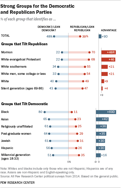
I came across an old blog post where the author (Jeff Shaffer) attempted to recreate the Pew Research graph (included below) using Tableau. He succeeded—to my eye at least—and made something that looks really attractive and really close to the original Pew graph. See the original blog post for a comparison between the original and his reconstruction
Reading the post got me wondering if I could recreate the Pew graph myself using R and ggplot2. There is a ton of “non-standard” stuff going on in the original Pew graph (for starters, it’s not really one graph. It’s six) and I was curious how close I could get.
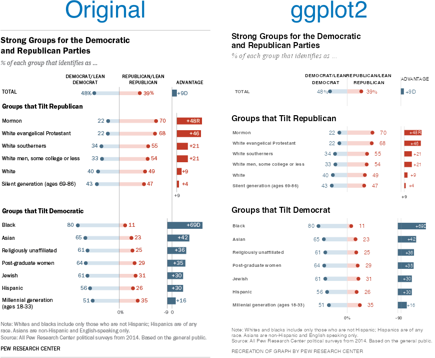
Turns out I was able to get pretty close, I think. Here’s my final version side-by-side with the original. There are a couple of detailed that I couldn’t solve (like the graphs are just a little too compressed). And the process of creating this was…fiddly, to say the least. I ended up with numerous ‘magic’ constants that I had to revise over and over until I got something that looked reasonable1 . And one bit—adding spaces to a label to push its alignment left—I’m downright ashamed of (but I couldn’t find another way to accomplish my goal). Still, I’m pretty happy with the final product.

Note, like the original post’s author, I’m not sure I’d argue this is the best way to display this data. The odd axis treatment on the right hand bar charts seems likely to confuse. But, still, this is an attractive visualizations and I’ve always appreciated Pew’s “house” style.
If you’re interested in the code, I’ve posted it to GitHub.
- There are a lot more hardcoded constants throughout my code, but seven parameters gave me enough trouble that I created named constants for them. ↩︎
