Much virtual ink has been spilled recently discussing “vibe” coding. Broadly defined, vibe coding is an AI-driven software development approach where developers use natural language prompts to generate and refine code. In this approach, the developer focuses more on the app’s functionality (“the vibe”) rather than writing code line-by-line. This, in theory, allows folks with little to no programming knowledge to create applications.
I’ve been experimenting with vibe coding, recently. I’ve built iPhone apps to help me focus, web apps to track family chores, and command line tools to help keep my computer organized. In each case, I’ve done minimal (approaching zero) direct writing of code and have relied on natural language prompts to the LLMs to produce the code and make adjustments. And in each case I’ve been impressed with the ability for LLMs to take my (sometimes vague) input, parse it, and turn it into compilable code.
So naturally, I’ve been wondering: if vibe coding can produce a working iPhone app from a few prompts, can the same approach work for analytics? I’ve spent large parts of my career borrowing concepts and best practices from the world of software engineering and applying them to the realm of social science analytics, and I’ve seen huge gains from doing so. But the more I think about it, the more I believe that the jump from vibe coding to “vibe analytics” isn’t just a lateral move — it’s a category error. While analytic programming and traditional programming look similar on the surface, they are fundamentally different in ways that make purely vibe-coded analytics not just impractical but genuinely dangerous.
How do they differ? Perhaps most importantly, the output of an analysis is, ultimately, a judgement. In traditional programming, correctness is usually binary and verifiable. The app either crashes or it doesn’t. In analytics, the output is a a number, a chart, or a conclusion requiring domain judgement. A query can run perfectly and return a completely misleading result. The LLM has no way to know that the statistics are off because it double-counted arrests. And neither will you unless you already understand the data well enough to sanity-check it.
That leads naturally to the difference between code, which is structured and has meaning that can be understood generically, and data, which is structured but has meaning that is almost entirely local to your organization. What does “active user” mean in your schema? Why does the orders table have two date columns and which one should you use? Why are there nulls in that field — is that meaningful or an artifact? LLMs can guess (and boy do they) but they cannot know, and bad assumptions here produce plausible-looking wrong answers.
And if our data requires local domain knowledge, well so do our programming goals. Traditional programming usually starts with a reasonably well-defined spec. Analytics often starts with a vague business question where part of the job is figuring out what the right question even is. “What’s driving churn?” isn’t a spec — it’s a research agenda. LLMs are good at executing defined tasks but less good at the iterative negotiation between data, business context, and question refinement that characterizes real analytics work.
The local nature of both data and purpose lead to another problem: the subtlety of errors. One of the most common analytics bugs is joining tables at the wrong level or direction and silently inflating or deflating metrics. A traditional programmer writing a wrong join usually gets an obvious error. An analyst writing a wrong join gets a confident-looking number that might be off by 300%. LLMs are particularly prone to this because they’ll generate syntactically correct SQL that joins on whatever seems reasonable without understanding the context of your specific tables.
I’ve been amazed by LLMs’ ability to write code, test itself and then correct itself. But in software engineering there’s a rich culture of unit tests, integration tests, and CI pipelines that catch regressions. In analytics, most work is exploratory and one-off, so there’s rarely a test suite. When you vibe code an app feature, you can at least click around and see if it works. When you vibe code an analysis, the only real test is whether someone with deep domain knowledge reviews the logic.
None of this means LLMs have no role in analytics — far from it. My own early experiments using LLMs to assist me in analysis have been promising. LLMs are excellent at accelerating the mechanical parts of the work: drafting boilerplate SQL, suggesting visualization approaches, writing documentation, and even helping think through edge cases in a dataset. The key word, though, is assist. Every one of those tasks still benefits from — and in most cases requires — a human who understands the data, the business context, the questions, and, yes, the code well enough to evaluate what the LLM produces.
I’ve been experimenting with various agentic agents for programming for a little while now. But I’ve haven’t tried using it for any analysis work. Until today.
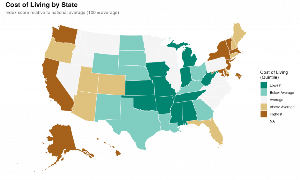
What I found was impressive. With a few prompts and a little back-and-forth, I was able to quickly produce a relatively attractive choropleth map showing state level cost of living data.
I started with a simple setup prompt just to see if everything was working.
> create a git repo for this project and add folders for code, data, and output
It was, and it did, also creating .gitkeep files in each of the empty directories and a .gitignore file. I noticed during the planning that I hadn’t specified that I’d be using R as my language, so I added some additional context so it could make the .gitignore more relevant.
> add commong R patterns to the .gitignore
It figured it out despite my typo.
Once that was all executed, it was time for the main prompt on the task. I’ve heard that the best way to talk to claude code is to just treat it like a experienced engineer. So that’s what I did
> Our goal is to create a state-level chloropleth map of the United States showing the relative cost of living for each state. We will be using R as our language with the tidyverse library. For the map shape file we will use the usmap library. The data is in a csv file at data/cost_of_living.csv. Break the states into quintiles based on the cost_of_living score and pick an attractive diverging color scheme for plotting. Make sure to use ggplot for the graph and to give the final version a title and meaningful legend labels. Save the output and a .png to the output directory with dimensions of 10x6 inches.
I submitted that and sat back and watched it work. It took a couple minutes to grind through it and I noticed that at least once it tried to execute the code and got an error. But it recognized the error and corrected the code and reran without my intervention.
The results were fine and I could have stopped there, but I wanted to see how well it did with changes and edits. So, first, I asked it to change the color scheme. I told it exactly what palette I wanted.
> instead of the RdYlGn palette, use the diverging type pallete #1
Again, it figured it out despite my typo. Looking at the code itself, It didn’t exactly follow my directions/expectations (I expected it to specify the palette by number; it instead figured out the palette by I meant and used the name). But, technically, it was exactly correct.
Finally I gave it a slightly hard challenge.
> It's hard in the map to see DC because it's so small. Make it larger and move it slightly off the coast of Maryland
This took a while for Code to think through and required a larger refactor of the existing code along with the additional sf code to move DC. Again, watching it worked, it seemed to fail a few times along the way. But it kept at it and ultimately succeeded.
The final map is below. I thinks its pretty good. It took me about an hour, which is probably about what it would have taken me to do by hand (I would have had to research how to move DC for a while). But hour was significant time on my end checking up on Claude as it went. If I hadn’t been learning myself, I’ve no doubt this would have been significantly quicker than I could do alone. Like I said at the top, I’m impressed.
I’ve been fascinated by the potential of Github Copilot for quite some time now. I was so interested in playing with Copilot that, earlier this spring, I spent a fair bit of time learning to use Visual Studio Code and getting it set up for R development. And, while VS Code proved to not be especially to my liking (at least for R development and compared to RStudio), I was quickly enamored by my early experience with Copilot.
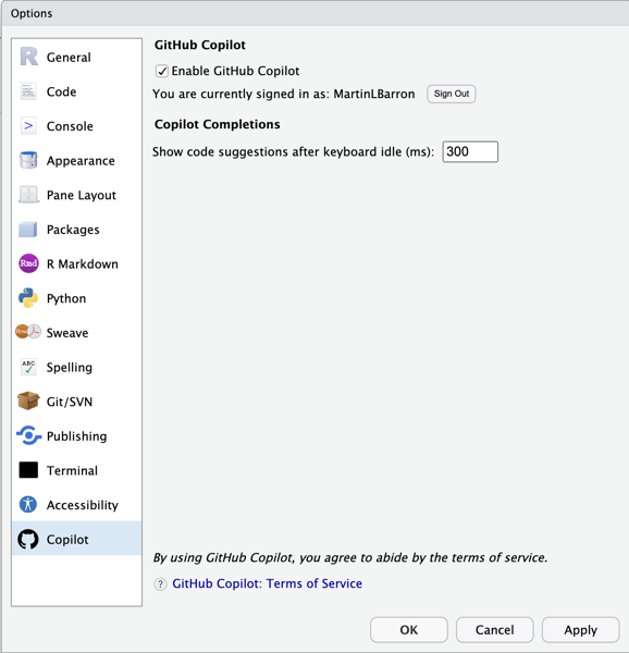
So when I saw this post pointing out that the development version of RStudio contained Copilot integration, I wasvery excited. I ignored all the big flashing “beware” signs that come along with a daily development build and downloaded it immediately.
While I’ve only been working with it a couple of days, I’m kinda in love. Here are some initial thoughts.
Setup
Setup is super easy. Simply open your global options (tool -> Global Options… -> Copilot) and enable it. You’ll need to sign into Copilot from RStudio, but that’s also just a simple process involving clicking a url, and entering the usage code presented1. One bug I stumbled across, in my limited experience, is that Rstudio’s not great at remembering that you’ve enabled Copilot. So you may find yourself having to turn it on again if you close and relaunch. But, daily build, beware, etc.
Usage
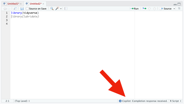
Once enabled, use of Copilot is very straightforward. Open an editor window; start typing. Copilot captures your code and suggest (through gray, italicized text). Like the selection? press tab to accept it. Don’t like it, simply continue typing (or press Esc) and the suggestion disappears.
If Copilot isn’t actively suggesting anything to you at the moment, the only visual indication that it’s running is some text in the lower right corner of the editor window. Otherwise, there are no visual differences to the interface.
From my experience with Copilot in VS Code, I know that it’s possible to have Copilot cycle through suggestions, if you don’t like the first. That appears to not be working yet in RStudio (or, at least, I couldn’t figure out how to trigger it). In VS Code (and other? IDEs) you can cycle using Option/Alt + ]. That does nothing, currently, in RStudio.
Code Suggestion
Of course, the whole point of Copilot is code completion and, more particularly, project-relevent code completion. So to do a minimal test, I need a project. So here’s the little toy task I set myself to try out Copilot: create a plot of drug crimes over time (relative to other crime types) for the city of Chicago. This is a really straight forward task with a few simple components:
Download the public crimes data from the City of Chicago’s website.
Explore the data to understand the variables and values of interest
Perform any necessary cleaning
Create my plot
As noted above, my first step is to just acquire the data from the City of Chicago’s public portal. Based on my previous experience with Copilot in VS Code, I knew Copilot offered reasonable suggestions based on comments, so I added:
Which…is exactly—and frighteningly—correct. I wasn’t about to trust it blindly, but 10 seconds of Googling confirmed that ijzp-q8t2 is, indeed, the cumulative crimes data I was looking for. And just like that, I kinda fell in love with Copilot all over again.
EDA
…And then Copilot seemed to break. I typed (and typed) and it suggeted nothing. All I wanted to do for my exploratory data analysis was to look at the list of variables, find the crime type variable and explore its values, and find the date variable and figure out its format. So I typed the following and Copilot suggested nothing at all.
Again, daily build, beware, etc. etc. I restarted, confirmed Copilot was enabled, and went back to work.
Data Cleaning
…And so did Copilot. I typed :
# recode `Primary Type`Df<-crime|>rename (
And it auto-suggested exactly what I was planning to do. It even recognized that I was using the native pipe character and anticipated—correctly—that I’d want to continue my pipeline:
Here I was faced with a little bit of a question. I didn’t actually intend to lump my factor levels here. My original intention was to simply transform the variable into a factor with all levels intact. But, lumping here wasn’t a bad idea. It just wasn’t my original intention. So, do I stick with my original intention or follow Copilot? I choose to follow Copilot, with a twist (rather than selecting the 10 largest levels, I lumped all levels where the proportion of cases was below .5%).
I then noticed that the raw data actually already did some grouping and had an “OTHER OFFENSE” category. So I needed to combine it with my new “Other” category. I didn’t remember the forcats command to do this…and neither did Copilot. It suggested I fct_gather() ….which isn’t a valid forcats function! What I was looking for was fct_collapse() or fct_other(). I ended up doing it myself as it seemed to really confuse Copilot.
Next up: date. Dates in this file are stored as character strings with format “MM/DD/YYYY HH:MM:SS AM/PM”. I wanted to transform this to a simple Date variable. I got to here:
I can never remember my date formats so—trust but verify—a little googling was needed. It showed that the Copilot suggestion was exactly what I was looking for.
Initial Plotting
I started the next section with a comment. I got to # Plot and Copilot filled in the result # Plot crime by date. Maybe that would have been better “crime type”, but it seemed good enough so I accepted it. Copilot then immediately added a ggplot block at me
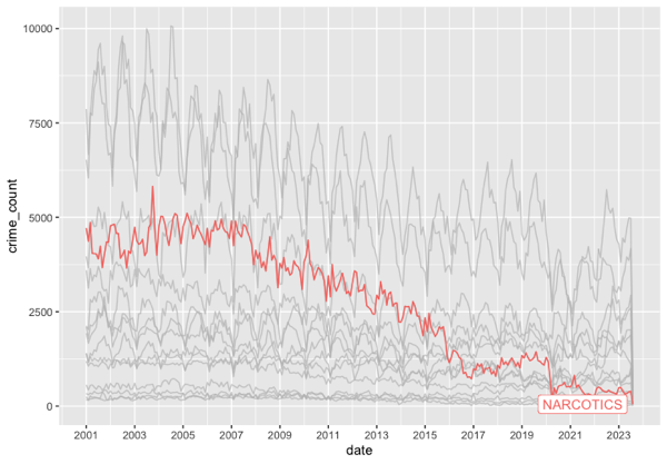
Now, I’ve never used geom_freqpoly—I had to google to see if it was real and what it did. It’s not what I was looking for but it’s not unreasonable, either. Here’s the plot it produced.
Not attractive, but in the ballpark. By binning to 30 days, we get rough monthly indicators and it appropriately scaled the axis to 1 month (though it mean the there were so many labels they were unreadable). It also is hard to tell what line is the narcotics line, which was my original goal—not that I’ve done anything to indicate that to Copilot.
Data Wrangling
I decided then to do some wrangling and get the data in shape to be plotted using geom_line. Specifically I wanted to truly summarize by month (not rely on a 30 day shorthand). So I needed to group the data by year, month, and primary type, summarize the counts, and then construct a new date variable indicating the aggregate month and year.
Copilot was moderately helpful here. To be honest, I knew what I needed to do and I just started typing. I kinda didn’t give Copilot much of a chance to chime in. Here’s what this chunk of code looked like.
# Prepare data for plottingdf<-df|>mutate(month=month(date), year=year(date)) |>group_by(year, month, primary_type) |>summarise(crime_count=n()) |>mutate(date=as.Date(paste(year, month, "01", sep="-"))) |>ungroup()
Final Plotting
Finally, with my data ready, I could create the plot I wanted. I was curious what it would do with a less well known package so I imported `gghighlight` and went to work. Here’s what Copilot suggested:
It guessed—correctly—that I wanted to use geom_line and that I wanted to use gghighlight. It didn’t get my intentions exactly right on gghighlight, but why would it. Here’s my final edits and the resulting graph. Drug crimes have basically bottomed out after a (slower) two decade decline.
Copilot isn’t perfect. But, wow. I’m impressed by it. More often than not, it knows exactly (or really closely) my intent and is able to give me some really useful starter code. I could easily see this becoming as indispensable to my coding as color coded syntax?
A few months back I gave an internal talk where I made some predictions for the future of analysis/data science. One of those was predictions was that my entire team would all be using something like Github Copilot before the end of the year. Having seen Copilot in action in RStudio, I’m more sure of this prediction than ever.
Postscript
There’s no real reason to look at it, but I posted the entire file of code generated above to Github. I needed to add a simple readme, so I created a blank text file, added “# Copilot RStudio Experiment” and it autofilled the following.
This is a simple experiment to test the capabilities of GitHub Copilot. The goal is to create a simple R script that will read in a CSV file, perform some basic data cleaning, and then create a plot.
This assumes you’re already signed up for Copilot and logged into Github. ↩︎
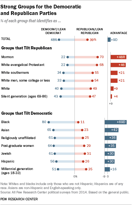
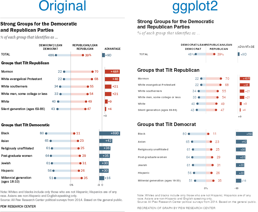
I came across an old blog post where the author (Jeff Shaffer) attempted to recreate the Pew Research graph (included below) using Tableau. He succeeded—to my eye at least—and made something that looks really attractive and really close to the original Pew graph. See the original blog post for a comparison between the original and his reconstruction
Reading the post got me wondering if I could recreate the Pew graph myself using R and ggplot2. There is a ton of “non-standard” stuff going on in the original Pew graph (for starters, it’s not really one graph. It’s six) and I was curious how close I could get.
Turns out I was able to get pretty close, I think. Here’s my final version side-by-side with the original. There are a couple of detailed that I couldn’t solve (like the graphs are just a little too compressed). And the process of creating this was…fiddly, to say the least. I ended up with numerous ‘magic’ constants that I had to revise over and over until I got something that looked reasonable1 . And one bit—adding spaces to a label to push its alignment left—I’m downright ashamed of (but I couldn’t find another way to accomplish my goal). Still, I’m pretty happy with the final product.
Note, like the original post’s author, I’m not sure I’d argue this is the best way to display this data. The odd axis treatment on the right hand bar charts seems likely to confuse. But, still, this is an attractive visualizations and I’ve always appreciated Pew’s “house” style.
If you’re interested in the code, I’ve posted it to GitHub.
There are a lot more hardcoded constants throughout my code, but seven parameters gave me enough trouble that I created named constants for them. ↩︎
I’ve been playing around with the ARtsy package. I’ve just been using the packages predefined functions with (mostly) function defaults. I finished going through a first pass at all the functions today. Here are my favorites among the many trial pieces I created.