One dumb thought at a time

Tag: visualization (Page 1 of 2)

Experiments With “Vibe Analyzing”

I’ve been experimenting with various agentic agents for programming for a little while now. But I’ve haven’t tried using it for any analysis work. Until today.

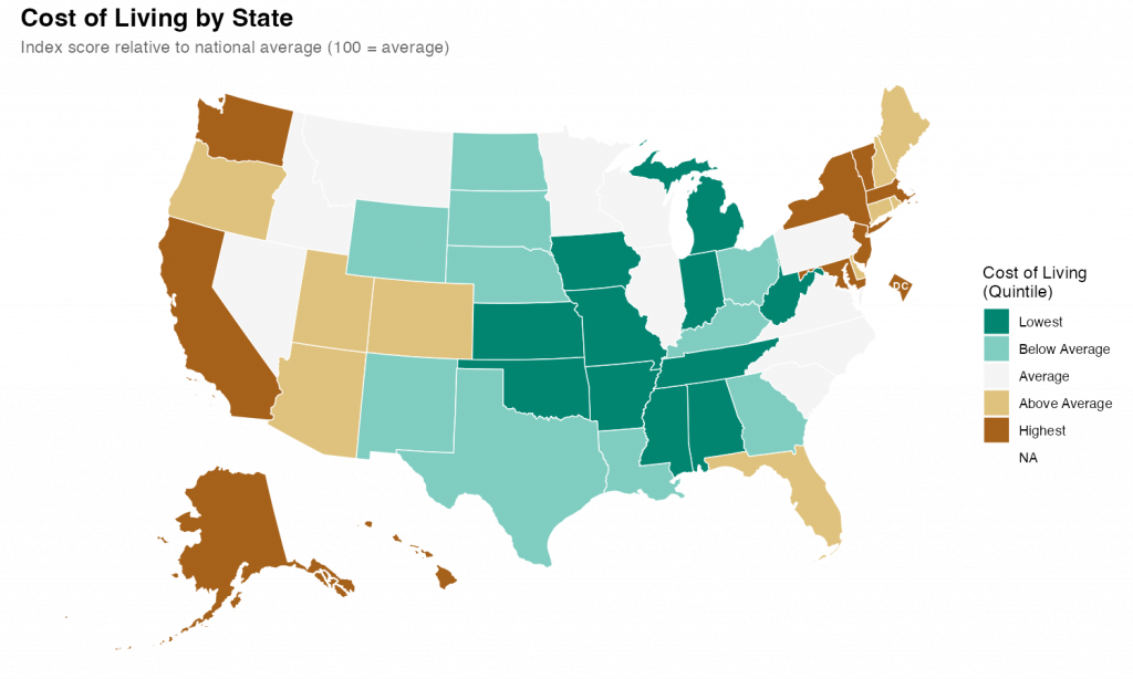
What I found was impressive. With a few prompts and a little back-and-forth, I was able to quickly produce a relatively attractive choropleth map showing state level cost of living data.

I started with a simple setup prompt just to see if everything was working.

> create a git repo for this project and add folders for code, data, and output

It was, and it did, also creating .gitkeep files in each of the empty directories and a .gitignore file. I noticed during the planning that I hadn’t specified that I’d be using R as my language, so I added some additional context so it could make the .gitignore more relevant.

> add commong R patterns to the .gitignore

It figured it out despite my typo.

Once that was all executed, it was time for the main prompt on the task. I’ve heard that the best way to talk to claude code is to just treat it like a experienced engineer. So that’s what I did

> Our goal is to create a state-level chloropleth map of the United States showing the relative cost of living for each state.  We will be using R as our language with the tidyverse library. For the map shape file we will use the usmap library. The data is in a csv file at data/cost_of_living.csv. Break the states into quintiles based on the cost_of_living score and pick an attractive diverging color scheme for plotting.  Make sure to use ggplot for the graph and to give the final version a title and meaningful legend labels.  Save the output and a .png to the output directory with dimensions of 10x6 inches.

I submitted that and sat back and watched it work. It took a couple minutes to grind through it and I noticed that at least once it tried to execute the code and got an error. But it recognized the error and corrected the code and reran without my intervention.

The results were fine and I could have stopped there, but I wanted to see how well it did with changes and edits. So, first, I asked it to change the color scheme. I told it exactly what palette I wanted.

> instead of the RdYlGn palette, use the diverging type pallete #1  

Again, it figured it out despite my typo. Looking at the code itself, It didn’t exactly follow my directions/expectations (I expected it to specify the palette by number; it instead figured out the palette by I meant and used the name). But, technically, it was exactly correct.

Finally I gave it a slightly hard challenge.

> It's hard in the map to see DC because it's so small.  Make it larger and move it slightly off the coast of Maryland        

This took a while for Code to think through and required a larger refactor of the existing code along with the additional sf code to move DC. Again, watching it worked, it seemed to fail a few times along the way. But it kept at it and ultimately succeeded.

The final map is below. I thinks its pretty good. It took me about an hour, which is probably about what it would have taken me to do by hand (I would have had to research how to move DC for a while). But hour was significant time on my end checking up on Claude as it went. If I hadn’t been learning myself, I’ve no doubt this would have been significantly quicker than I could do alone. Like I said at the top, I’m impressed.

Reconstructing A Complex Graph Using GGPlot2

I came across an old blog post where the author (Jeff Shaffer) attempted to recreate the Pew Research graph (included below) using Tableau. He succeeded—to my eye at least—and made something that looks really attractive and really close to the original Pew graph. See the original blog post for a comparison between the original and his reconstruction

Reading the post got me wondering if I could recreate the Pew graph myself using R and ggplot2. There is a ton of “non-standard” stuff going on in the original Pew graph (for starters, it’s not really one graph. It’s six) and I was curious how close I could get.

Turns out I was able to get pretty close, I think. Here’s my final version side-by-side with the original. There are a couple of detailed that I couldn’t solve (like the graphs are just a little too compressed). And the process of creating this was…fiddly, to say the least. I ended up with numerous ‘magic’ constants that I had to revise over and over until I got something that looked reasonable1 . And one bit—adding spaces to a label to push its alignment left—I’m downright ashamed of (but I couldn’t find another way to accomplish my goal). Still, I’m pretty happy with the final product.

Comparison of Pew Research graph and ggplot2 recreation.

Note, like the original post’s author, I’m not sure I’d argue this is the best way to display this data. The odd axis treatment on the right hand bar charts seems likely to confuse. But, still, this is an attractive visualizations and I’ve always appreciated Pew’s “house” style.

If you’re interested in the code, I’ve posted it to GitHub.

  1. There are a lot more hardcoded constants throughout my code, but seven parameters gave me enough trouble that I created named constants for them. ↩︎

Experiments with ARtsy

I’ve been playing around with the ARtsy package. I’ve just been using the packages predefined functions with (mostly) function defaults. I finished going through a first pass at all the functions today. Here are my favorites among the many trial pieces I created.

The Rise and Fall of generations

My previous post showing the definitions of different generations was in service of creating the chart below. This chart illustrates the “rise and fall” of generations across their lifecycle. As a new generation is born, it’s share of the population increases. Once a generations births have ended, there is a very long tail as people in that generation slowly die and new generations are born.

The data from the chart below comes from the U.S. Census bureau. I was able to use yearly population estimates from 1980 onward, but prior to 1980 the data comes from decennial Census PUMs data (hence why, for example, Gen X looks it starts in 1970–instead of 1965–and why the baby boomers have such an odd slope between 1960 and 1970). The Census Bureau does not publish birth year, so I estimated birth year (and thus generation) from age and year of estimate. There will thus ‘slop’ in my estimates but they should be close for my purpose here.

Chart showing the generational distribution of the U.S. population from 1940 - 2021

Defining the generations

Generations is a very… imprecise… sociological concept. People just sorta look at a rough cohort of ages and say “yeah, you all are a generation.” Start and end points (as well as labels) just sorta coalesce out of the ether.

Nevertheless, they have their use and certainly are cemented in the popular imagination. I’ve been doing some reading on generations and really appreciated this diagram and article by Pew Research. But I wish it went a little earlier and a little later. So I made my owner version, *heavily* influenced by the Pew version.

A diagram showing generation birth year starting with the Lost Generation (born 1883 - 1900) and ending with Generation Alpha (Born 2013-2030).
« Older posts

© 2026 Overthinking it

Theme by Anders NorenUp ↑