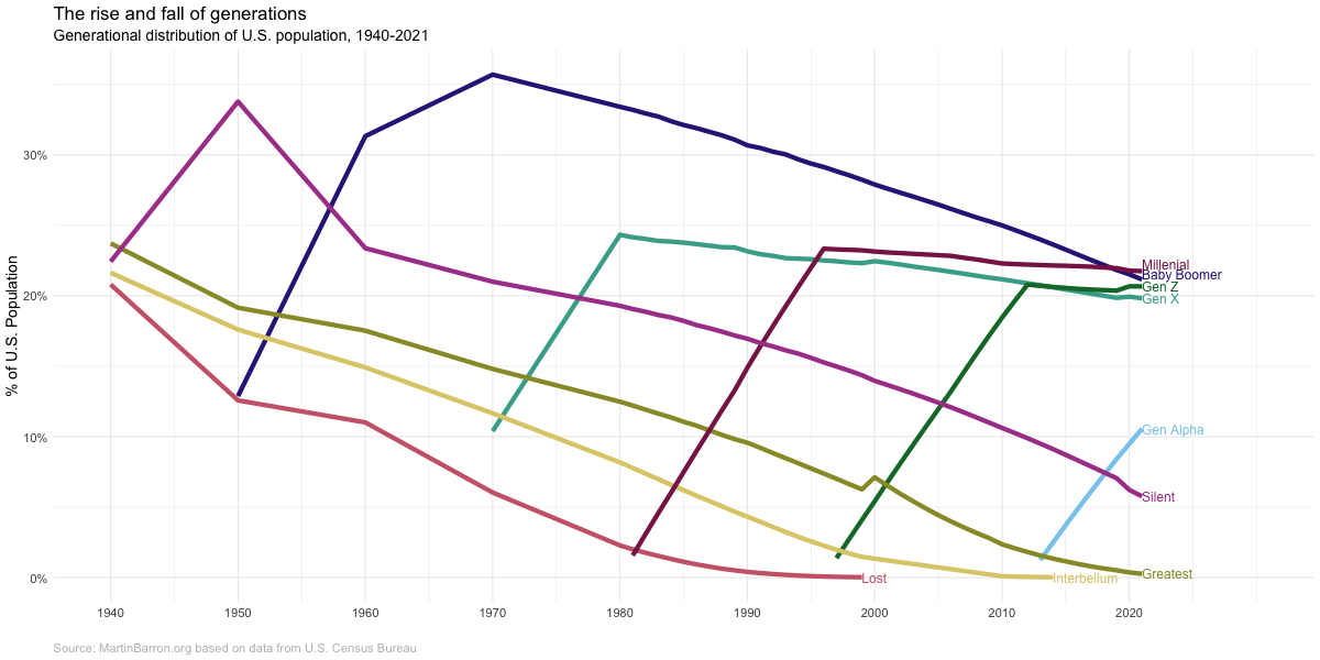
My previous post showing the definitions of different generations was in service of creating the chart below. This chart illustrates the “rise and fall” of generations across their lifecycle. As a new generation is born, it’s share of the population increases. Once a generations births have ended, there is a very long tail as people in that generation slowly die and new generations are born.
The data from the chart below comes from the U.S. Census bureau. I was able to use yearly population estimates from 1980 onward, but prior to 1980 the data comes from decennial Census PUMs data (hence why, for example, Gen X looks it starts in 1970–instead of 1965–and why the baby boomers have such an odd slope between 1960 and 1970). The Census Bureau does not publish birth year, so I estimated birth year (and thus generation) from age and year of estimate. There will thus ‘slop’ in my estimates but they should be close for my purpose here.
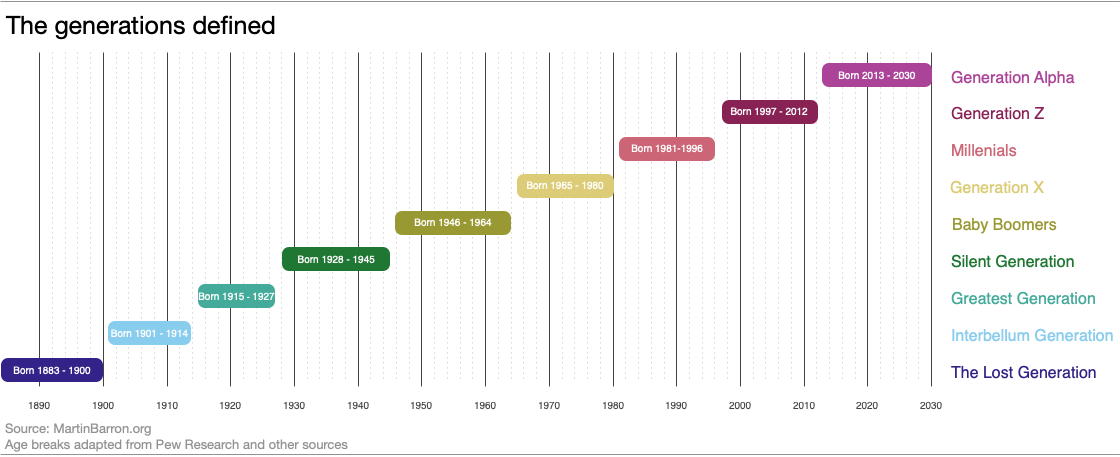
Generations is a very… imprecise… sociological concept. People just sorta look at a rough cohort of ages and say “yeah, you all are a generation.” Start and end points (as well as labels) just sorta coalesce out of the ether.
Nevertheless, they have their use and certainly are cemented in the popular imagination. I’ve been doing some reading on generations and really appreciated this diagram and article by Pew Research. But I wish it went a little earlier and a little later. So I made my owner version, *heavily* influenced by the Pew version.
I’ve started playing around with D3. If I’m going to be locked inside for months, I might as well learn something, right? (And it might just take months of being locked inside for me to actually understand D3.). Thought I’d post my first simple bar chart here. It shows the songs Fugazi played most frequently during their live shows. To do this in WordPress, I’m currently embedding another html file, change it to pre-formatted, and then changing it again to paragraph (no idea why this last step is necessary). But is seems to work.
Previously we showed that Fugazi had a few songs that they played a lot and a number of songs that they played pretty infrequently. In this post we look at what those songs were.
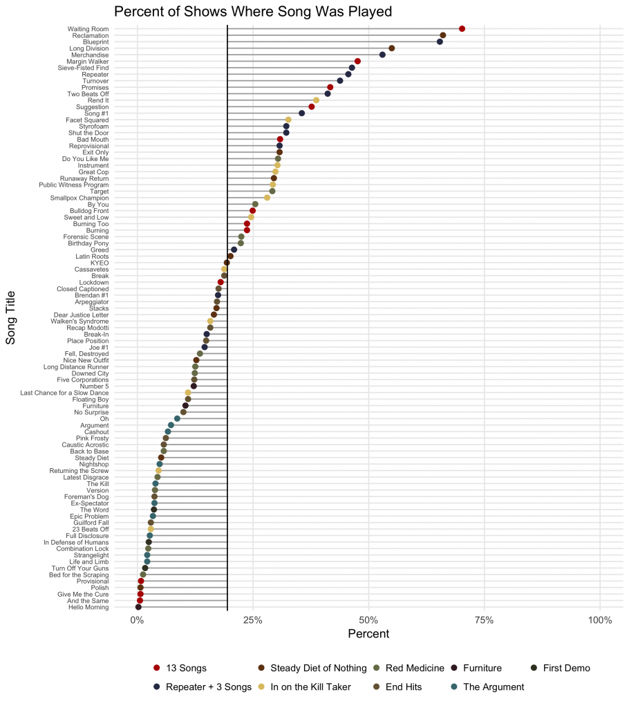
The graph below shows all of Fugazi’s songs, plotted by the percentage of shows where the song was played. I include a vertical line representing the average across all songs (19.4%) and draw drop lines from each point to the average.
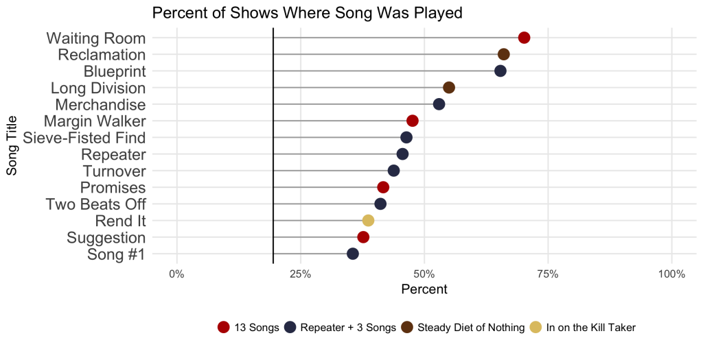
A couple things are obvious right away. First, it’s really hard to plot this many discrete points. We’ll fix that in a moment. Second, and more to the point, there is clearly a cluster of 14 songs that are played far and away more than others. We zoom in on those songs in the next chart.
Within the most played 14 sogs there are five songs that were played in more than 50% of Fugazi’s shows. Three (Blueprint, Reclamation, and Waiting Room) were played in 65% or more of live shows. And one song stands out as their most popular song to play lived: Waiting Room, which was played live in more than 70% of their shows.
No great surprises here. Waiting room was song one on their first EP. Seems pretty natural that it would have been played most frequently. And the other songs are all some of my favorites. I’m a little surprised that only one song from In on the Kill Taker made it onto the list and it was Rend It (I would have guessed Cassavetes or Smallpox Champion), but still, nothing on the list is shocking. Most of the top songs are among my favorites, at least from the first few albums
Indeed the top 14 are dominated by songs from 13 Songs and Repeater +3. This also is not surprising; You can’t play a song live if you haven’t written it. Nevertheless, there definitely seems to be some clustering by album going on here. We’ll take a closer look at that in the next post.
If you want, you can listen to the top 14 Fugazi tracks below.